Stop Refreshing the Page: Speed Up UI Development with Storybook
Editing a modal inside a dashboard requires 5 clicks to see changes? Isolate your UI with Storybook and develop components 10x faster.

Editing a modal inside a dashboard requires 5 clicks to see changes? Isolate your UI with Storybook and develop components 10x faster.
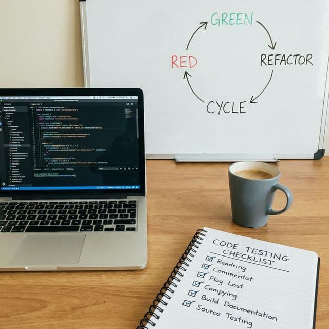
Writing test BEFORE code. Red -> Green -> Refactor. The Double-Entry Bookkeeping of Programming.

Backend: 'Done.' Frontend: 'How to use?'. Automate this conversation with Swagger.

'It works on my machine' is no longer an excuse. Robots test (CI) and deploy (CD) when you push code. Deploy 100 times a day with automation pipelines.

Frontend development blocked by unfinished APIs. MSW intercepts requests at the network level so you can build and test without a real backend.

Need to fix the PaymentErrorModal.
Workflow:
This repetitive stress injury is real. "I just want to see the modal and edit it!"
I thought Storybook was for Design Systems documentation. "We are a startup. No time for docs. We need features."
But Storybook is about Development Velocity, not just documentation.
It's a "Component Lab" where you isolate (Isolation) and build a component without running the whole app context.
I viewed it as "Engine Bench Testing."
Launch Storybook -> Click PaymentErrorModal -> There it is.
Instant feedback loop. No login required.
Create Button.stories.tsx next to your component.
import type { Meta, StoryObj } from '@storybook/react';
import { Button } from './Button';

const meta: Meta<typeof Button> = {
  component: Button,
  title: 'Common/Button',
};
export default meta;

type Story = StoryObj<typeof Button>;

export const Error: Story = {
  args: {
    variant: 'danger',
    label: 'Error State',
  },
};
This specific state is now permanently accessible via a URL.
http://localhost:6006/?path=/story/common-button--error
Storybook provides UI Controls (Knobs) automatically based on TypeScript types.
Change text, colors, booleans (isLoading) in real-time without touching code.
Give this link to designers.
"The font looks small? Here, try changing it yourself in the browser."
This reduces communication overhead significantly.
"Does it break with 100-character long text?" In the real app, creating a user with a 100-char name is hard. In Storybook, it takes 1 second.
export const LongText: Story = {
  args: {
    label: 'Very very very long label that might break layout if flexbox is wrong',
  },
};
Catch CSS bugs (overflow, wrapping) before they hit production.
"But my component fetches data from /api/user!"
Use msw-storybook-addon. It mocks network requests at the Service Worker level.
// UserProfile.stories.tsx
import { http, HttpResponse } from 'msw';

export const Success: Story = {
  parameters: {
    msw: {
      handlers: [
        http.get('/api/user', () => {
          return HttpResponse.json({
            name: 'Batman',
            role: 'Admin'
          });
        }),
      ],
    },
  },
};
Now you can develop the "Success State", "Loading State", and "500 Error State" independently of the actual backend status. Even if the backend server is down, Frontend development continues.
Storybook isn't just static. It can simulate user interactions using the play function (powered by Testing Library).
import { userEvent, within, expect } from '@storybook/test';

export const LoginFormFilled: Story = {
  play: async ({ canvasElement }) => {
    const canvas = within(canvasElement);

    // Simulate User Typing
    await userEvent.type(canvas.getByLabelText('Email'), 'test@example.com');
    await userEvent.type(canvas.getByLabelText('Password'), 'password123');

    // Simulate Click
    await userEvent.click(canvas.getByRole('button', { name: /login/i }));

    // Assert Result
    await expect(canvas.getByText('Welcome back!')).toBeInTheDocument();
  },
};
This acts as a mini E2E test that runs every time you view the story.
It serves as living documentation of "How this component is supposed to behave."
You can run these tests in your CI/CD pipeline using the Test Runner (npm run test-storybook).
Install storybook-addon-a11y.
It automatically checks your component against WCAG standards.
alt attribute."Fixing accessibility issues after development is a nightmare. Fixing them while building the component in Storybook is trivial. It empowers developers to build inclusive apps without needing to be Accessibility Experts.
Since you have all these stories (states), why not use them for regression testing? Chromatic (made by Storybook maintainers) takes screenshots of every story in every commit.
Button.css padding by 2px.Button, Header (uses button), Form (uses button).It catches "Visual Bugs" that Unit Tests (Jest) cannot see. "The button is functional, but it's invisible because it's white on white." -> Chromatic catches this.
Use storybook-addon-designs.
You can embed the specific Figma frame right next to the Storybook preview.
Developer Experience: Left pane: Live Code Component. Right pane: Original Figma Design. Goal: Make them look identical.
This "Pixel Perfect" comparison workflow eliminates the endless "Can you move it 1px to the left?" feedback loop.
Q: Storybook feels slow to start.
A: Modern Storybook (v7+) uses Vite or Turbopack builders. It starts in milliseconds. If you are on Webpack, consider migrating to @storybook/builder-vite.
Q: Maintaining stories is extra work. A: Yes, it is an upfront cost. But it saves "Debugging Time" and "Communication Time". The total time saved is massive. Think of it as "writing standard operating procedures" for your UI.
Q: Can I use it for full pages?
A: Yes! You can mock Redux, Router, and Context in decorators. Developing entire pages in Storybook is the ultimate level of CDD.
play function to verify behavior, not just looks.Stop refreshing the page. Start building stories.